Strategy Game Battle UI
Oct 15, 2016
I was doing research on trends in the Strategy Game UI styles. And you can see a clear pattern that starts with simple left or right bar. Transitions into more complex top and bottom bars and then finally into widgets that stick out all around the screen.
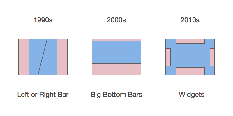
The switch from left or right bars to bottom bars was probably a purely stylistic choice or some thing to do with screen resolutions getting bigger, but transition to widgets is all to do with UI scaling. You should probably use widgets from now on.
Interfaces are Huge!
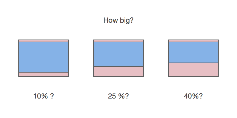
If you ask me to draw it out from memory I would make it tiny! My memory just does not remember the UI taking up that much room, but it does. It’s like some sort of optical illusion? I would say UI takes up 10% to 25%, but in reality it's more like 25% to 40%. So make your UIs big, players don’t see them?
Widget Placement
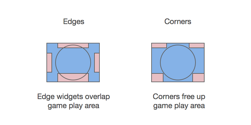
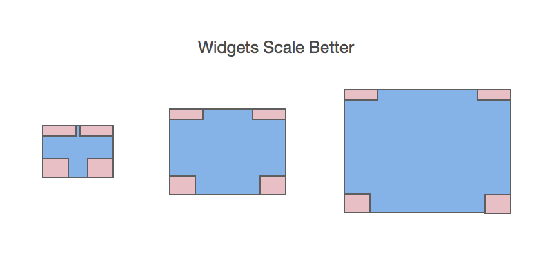
When you have a widget style interface you can choose whether its a corner interface or an edges interface. I feel that the corner interfaces are better because they don’t waste the corners to the dead area of the screen.
Widgets Scaling
Widgets scale better to different screen sizes. As size grows more empty areas can be just taken over by the game itself. Although widgets should probably also grow a little with screen size.
Left or Right Bar
First RTS game was Dune II. At first glance people see the game board. Its interesting to note that the UI for building and stuff takes so much space. Its surprising how big he UI actually is.
Dune — first RTS game
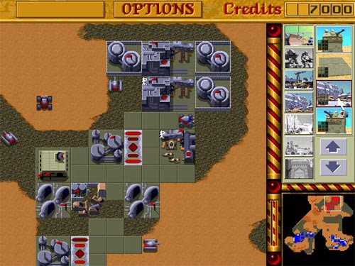
The right bar UI is Westwood’s style of RTS UI. They did this for most of their Command and Conquer games.
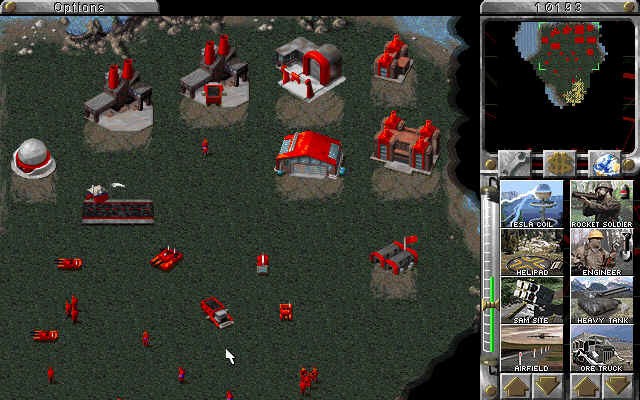
Command and Conquer: Red Alert
It seems that during the golden age of RTS games (1994–2003) each game company decided to pick a spot to brand their RTS.
Blizzard a main competitor to Westwood at the time decided to use very similar bar but on the left. Dunes interface was dominated by the build bar, which was always shown. This is standard for Westwood games, the UI is not context sensitive and always shows construction, which is independent of what building might be selected. Warcraft’s menu is context sensitive, allowing units to have multiple abilities and commands.
WarCraft 1
Total Annihilation also decided to have the bar on the left. But notice how much smaller it is as a percentage of the screen. That is because it could scale to be smaller as the resolution of the screen increased.
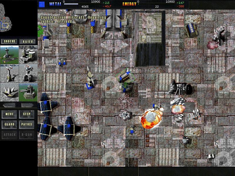
Total Annihilation
Top and Bottom Bar
Age of Empires decided to take a top bar bottom bar approach. It appears every one started to adopt this strategy from then on.
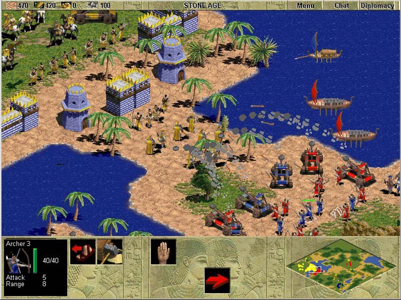
Age of Empires
StarCraft decided to spice it up by having a very complex shaped bar made out of 4 pieces. Did they copy Age of Empires? I think Blizzard just realised that bottom bar is better.
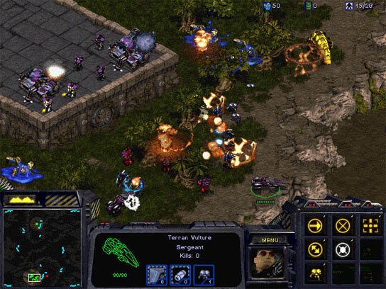
StarCraft 1
The top and bottom became standard interface in strategy games after Starcraft and pretty much everyone else used it.
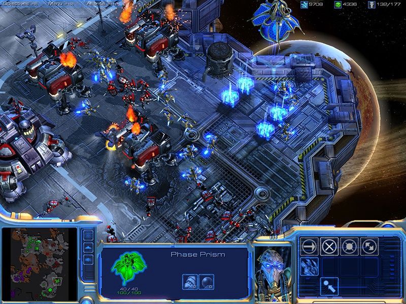
StarCraft 2
Spiritual remake to Total Annihilation (which used left bar), Supreme Commander decide to use the the top-bottom bar.
Supreme Commander
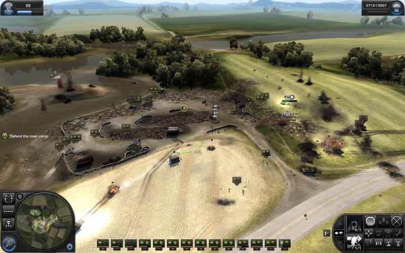
Relic’s Company of Heroes also follows this trend.
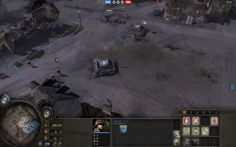
Company of Heroes
Widgets, Widgets, Widgets
Probably inspired by the interfaces of FPS games, which generally had minimal hud. Strategy game interfaces also became more widget and HUD like.
Homeworld 2 fixed the UI issues of the first Homeworld. And here you can see it being kind of a hybrid between the bottom bar and widget interface. The main “build, research, and launch” widget would pull out to reveal a complex UI.
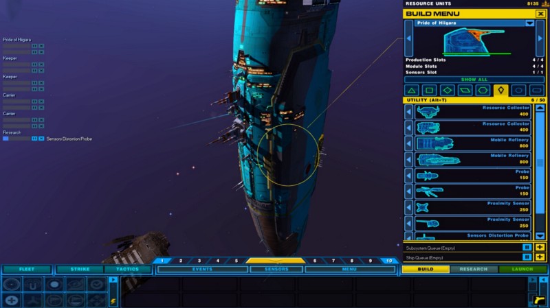
Homeworld 2 Remastered
Speaking of complex UI’s Nexus: The Jupiter Incident takes the cake. Its interface is probably one of the more complex ones. Only the 4X games could have something more complex.
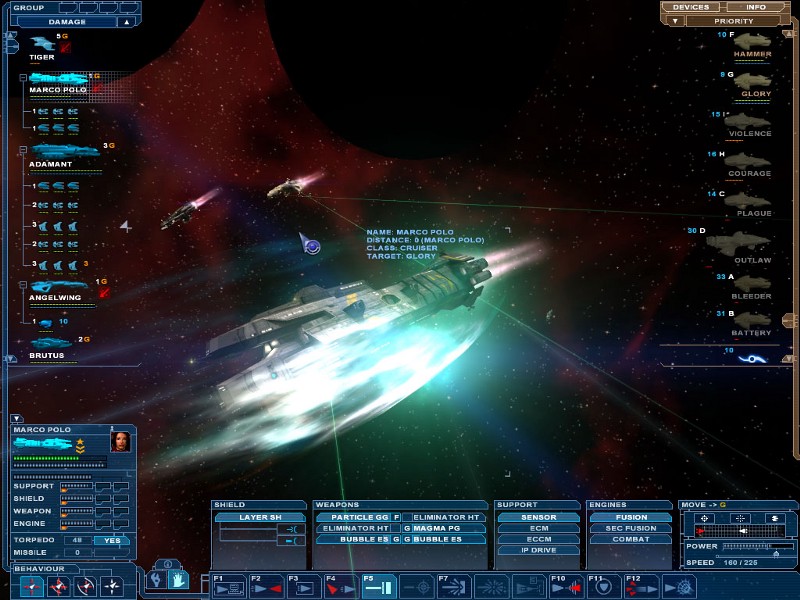 Nexus: The Jupiter Incident
Speaking of real time 4X games. Sins of a Solar Empire — is extremely complex UI. With everything expanding to more menus and widgets. The right side being a scrollable list of every ship you have! It's a beast.
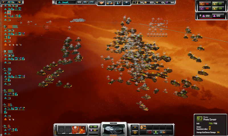
Sins of a Solar Empire
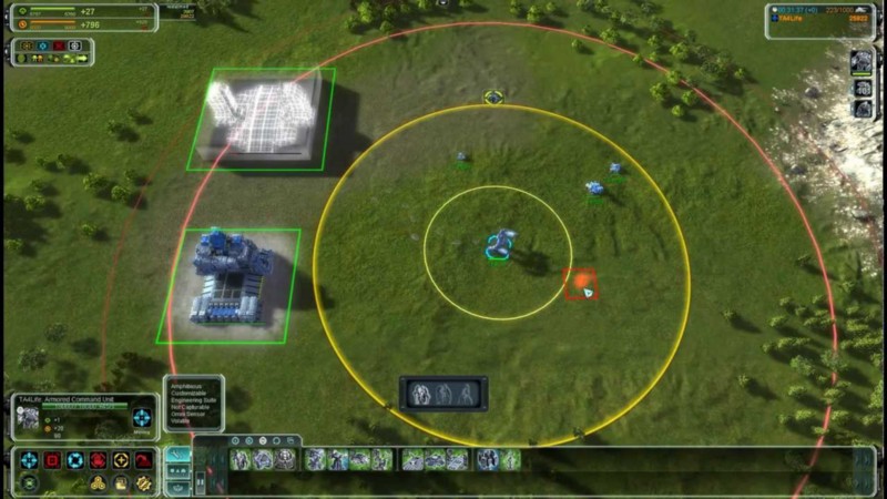
Planetary Annihilation is interesting because you could see their battle UI change during the development process. First it focused on a lot of dropdown that would expand out to show more information.
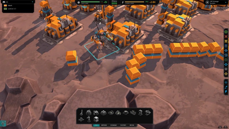 Planetary Annihilation
But then the interface components got bigger and started to show more info. Some of them still could be expanded but it was no longer a requirement.
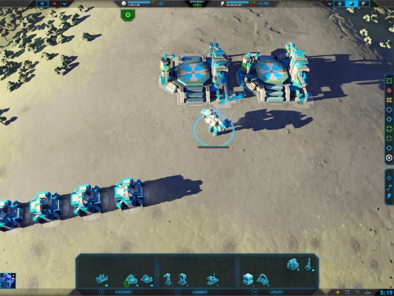
Planetary Annihilation
I really like Word in Conflict and its extremely minimal UI interface. Just like in Homeworld the build tab folds out. But while you are fighting everything its neatly tucked away. Here you can clearly see the influence from FPS games.
Word in Conflict
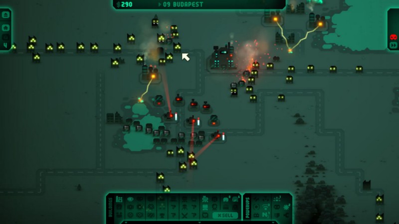
Revenge of the Titans also has an interesting glowy interface. Just like World in Conflict it is focused on providing different widgets that are attached to the edges of the screen.
Warhammer 40,000: Dawn of War II Is pretty cool being an strategy/RPG hybrid. Again using a widget interface that has become so common.
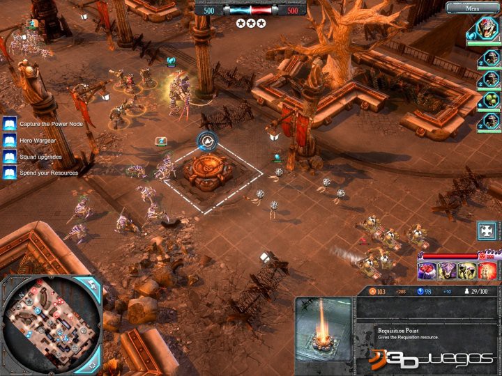
Warhammer 40,000: Dawn of War II
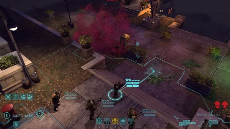
XCOM 2 UI also has extremely minimal UI which HUD like. Minimap is also gone.